Year to date, the ASX 200 is up 1%. That gain, however, is yet again lagging the performance of key US indices.
The difference in performance is not something that only happened this year. The US has been outperforming for 16 years, which is the longest streak ever. The size of the performance gap has equally never been as wide, with the gap truly opening since 2015. Both equity markets are in the global top three of best performing share markets longer term. It makes the current outperformance of US markets even more remarkable. Were reversion to the mean to kick in at some point, as it did in 2000, the local market would have a lot of catching up to do.
Is it feasible we will see that performance gap disappear and both markets converge again?
To find the answer, we need to investigate whether there is a fundamental reason as to why the US is outperforming so strongly and for so long. If we find that fundamental reason, and it remains in place, we might need to conclude there’s no reversion to the mean on the horizon, not until underlying fundamentals change.
The basic basics – a visual observation
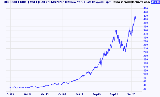
Below is a post-GFC price chart of Microsoft shares, one of index heavyweight in the US. It shows the occasional bout of volatility, and there are sell-offs along the way, but ultimately the share price moves from the bottom left-hand corner on the chart to the right-hand corner near the top. As a longer term, buy & hold type investor, this looks like the perfect stock to own. Given its strong and defined trajectory, this might also provide us with the answer we are looking for.

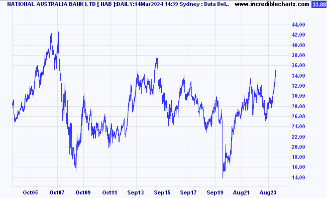
Let’s compare with one of our major local index constituents. Below is the comparable chart for National Australia Bank (NAB).

NAB shares over 16 years have gone through a lot of volatility, as have Microsoft shares, but, ultimately, they’ve made no real progress over that time.
Could we possibly have found the explanation for the big gap in relative performances between both markets? Some people might say Microsoft is a technology company. And NAB is a bank. That's your explanation right there. So, let’s stay inside the finance sector in Australia, let’s compare the banks.
The worst performer in Australia among the Big Four is Westpac (WBC). If one held those shares from the absolute bottom in the GFC (6 March 2009) until early March this year, the return amounts to 4.7% per annum on average, plus dividends, and franking. Adding dividends pulls up total return to between 9-10% per annum. Many an investor would think that’s far from bad. But we are measuring from the bottom of the GFC. If we measure from a later date, when share price levels were higher, that 4.7% quickly reduces towards zero. All that’s left then, on the long-term average, are the dividends and franking.
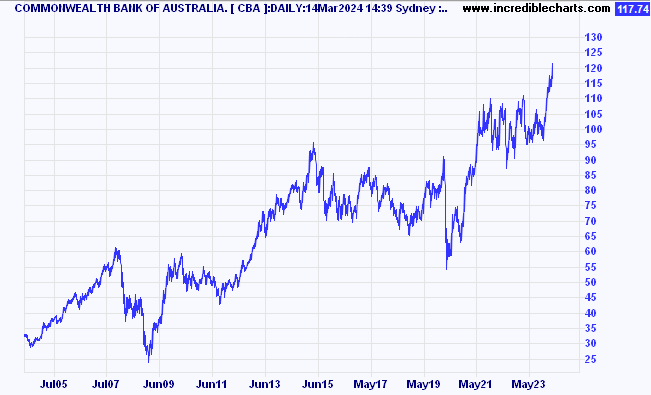
The obvious comparison to make locally is with CommBank (CBA).

Same starting point, same length of holding period, and the average return is more than 22% per annum, ex-dividends.
The difference is enormous.
If we were to compare with Macquarie Group (MQG), not quite apples versus apples, but we are inside banks and financials nevertheless, the average return climbs to 68% per year. Plus dividends on top.
I guess what we are discovering is this is not about technology versus banks.
A few additional observations:
Westpac is the ‘cheapest’ of the banks. CommBank is the most ‘expensive’, not only at the end of the holding period, but CBA has been the most expensive throughout the whole 16 years.
CommBank pays the lowest yield in the sector. Westpac pays the highest yield. Macquarie sits on both accounts closer to CommBank than to Westpac.
Worth highlighting: the cheapest stock has generated the worst return. The highest yield equals the worst return.
Comparing all four of the Big Banks in Australia, the price chart for CBA looks like that of Microsoft, while the other three don’t.
What could potentially explain the difference?
The quality in businesses
In his recent homage to the late Charlie Munger, Warren Buffett wrote:
“Charlie, in 1965, promptly advised me: “Warren, forget about ever buying another company like Berkshire. But now that you control Berkshire, add to it wonderful businesses purchased at fair prices and give up buying fair businesses at wonderful prices.”
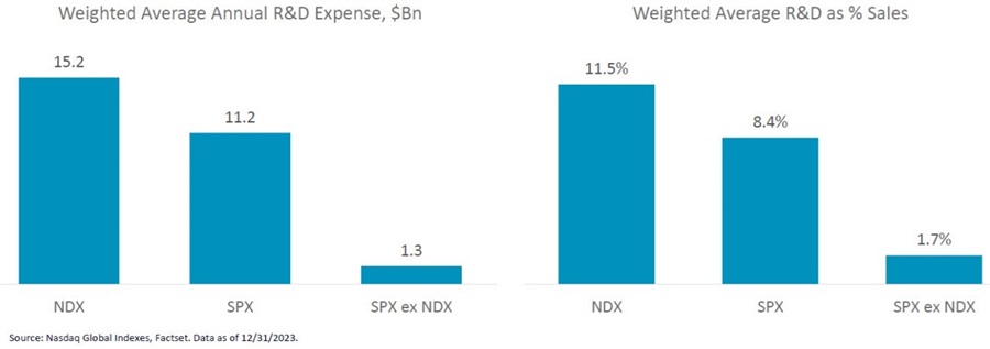
Could this be the answer we are looking for? If so, how do we identify ‘wonderful’ businesses? Analysis conducted by Betashares and others suggests a strong correlation exists between companies that invest and those that don’t, or only a little. That correlation becomes strikingly evident when we compare Nasdaq (NDX) companies with those in the S&P500 (SPX), while removing those from the Nasdaq that are also in the S&P500.

As a percentage of sales, investments by the Nasdaq winners are significant if one also considers how large some of those companies are, like Meta, for example, or Alphabet, or Microsoft.
So… what makes a wonderful company, according to this research, is that it invests, on average, ten times as much as others, on developing new products, on reinforcing the moat, on strengthening market share, on improving and expanding products and services, etc.
At the macro-level, the world is still operating inside a slow growth environment, and we have been for quite a while. The additional key change is that we are living through an almost unprecedented time of technological advances, innovations, and changes.
Not every company is equally equipped to stay on trend with the many changes happening. This might explain why since 2015 share prices have become noticeably polarised between the Haves and the Have Nots. Certainly, AI has the potential to further polarise economies and companies.
As investors, we need to ask ourselves the question what is more important; the short-term valuation or the prospect to enjoy strong investment returns over an elongated period? Longer-term price charts for ASX-listed companies including Car Group (CAR), Goodman Group (GMG), NextDC (NXT), REA Group (REA), and TechnologyOne (TNE) are not dissimilar from CBA’s and Microsoft’s.
Maybe one observation to add is that investors can enjoy US-type returns in Australia, assuming the portfolio includes Microsoft-type companies. And I am not necessarily referring to the technology component of that reference.
Rudi Filapek-Vandyck is Editor at the FNArena newsletter, see www.fnarena.com. This article has been prepared for educational purposes and is not meant to be a substitute for tailored financial advice.