Last month, we looked at how Australian shares performed in the last decade in terms of the winners (healthcare, tech, utilities) and losers (miners, oil/gas, telcos, banks). This time we look at how Australian shares fared in relation to other asset classes in diversified portfolios.
Then we break down the underlying components of the performance of Australian shares, and see what they suggest for the future.
Australian equities versus other assets
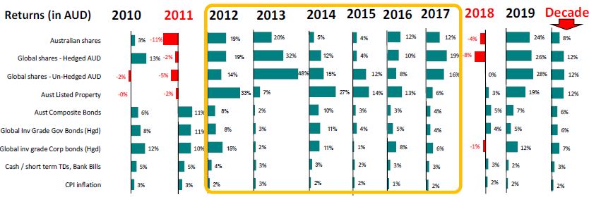
Australian shares had a relatively poor decade in the 2010s, with total returns (share price gains plus dividends) of 8% per year. This is below the long-term average of around 11% per year. The 8% was lower than 12% per year from international shares and Australian listed property trusts. Coming in at 6% per year were Australian and international bonds, but with much lower volatility than shares.
Here are the total returns from the major asset classes (in Australian dollars) for each of the past 10 years, and the decade averages at right.

It would have been reasonable to expect that returns from shares would be relatively good in the 2010s because the decade started out from a low base after the share price crash in 2008 and the partial rebound in 2009, but it was not to be. 2010 was a continuation of the 2009 rebound, but Australian shares were hurt by four rate hikes by the RBA due to rising inflation in the China-led commodities surge.
Then came the great ‘QE’ boom (quantitative easing: central banks buying assets with newly printed money to force down interest rates in order to entice people to buy shares – which they did!). The result was a six-year run of positive real (after inflation) returns from all main asset classes.
This had never happened before and will probably never happen again.
But in 2017, we saw three Fed rate hikes and the European Central Bank talked about closing its QE programme. It was the end of the great six-year golden era for returns. In 2018 share prices fell everywhere and bonds also posted low returns - an unusual combination. The triggers included rate hikes from the US plus slowdown fears in China, stagnation in Europe and Japan, fears of slowing growth in the US and Trump started his trade wars. As these worries eased, market strength returned in 2019.
There are also useful lessons in seeing where the returns from Australian shares actually come from.
Where do share returns come from?
The broad Australian share market has generated total returns (share price gains plus dividends, but before tax and franking credits) averaging 11.3% per year since 1980. It is tempting to simply assume that because the market has generated these good returns for such a long period, then it would be reasonable to expect this to continue over the next 10 years or so.
This is too simplistic. We need to understand the different sources of returns, and then to assess whether each of the components is likely to continue in future at the same rate, or higher, or lower, or maybe even reverse direction.
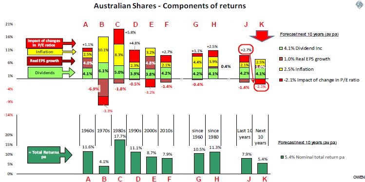
The chart below shows the sources of returns by decade since 1960 (columns A to F). Column G shows the average since 1960. H is since 1980, which breaks up the 11.3% from the prior chart. Column J shows the most recent 10 years (which in this edition is the same as the 2010s decade, column F), and K shows a forecast for the next 10 years. The bottom section shows average annual total returns in each period.

The first observation is that not only do the total returns to shareholders vary significantly in each decade, the sources differ even more.
Total shareholder returns over the past 10 years averaged 7.9% pa (column J), which is lower than post-1980 average of 11.3% (H). The main reason was that inflation (yellow bars) was lower over the past decade than it was since 1980.
These returns came from the following four sources:
- Dividends contributed 4.1% pa since 1980 and 4.2% pa over the past decade. This is the only component of returns that is likely to be sustainable at similar levels in the next 10 years (and is the only component that has been reasonably consistent over the prior century as well).
- Inflation contributed 3.9% pa since 1980 but only 2.1% over the past decade. Inflation over the next decade will probably average say 2.5%.
- Growth in real (ie excluding inflation) earnings (profits) per share contributed only +0.4% pa since 1980 and a negative -1.4% per year for the past decade. This is a very poor indictment of management of Australian companies over the past 40 years – to consistently fail to grow real profits per share even though the total economic pie in Australia has been growing by more than 3% per year (real GDP growth).
- Changes in price/earnings ratios are changes in the amount of money investors are willing to pay per dollar of profits. This contributed another +2.5% per year since 1980 and +2.7% per year over the past decade. Price/earnings ratios were 7.5 at the start of 1980, and 15.2 at the start of the last decade, but the ratio is 19.8 now. This means that investors paid $15.20 per dollar of company profits at the start of 2010 but they are willing to pay $19.80 per dollar now, which pushed share prices up by 30% (or 2.7% pa) for the same level of profits. People feel richer when they look at their share prices, but it is an illusion. They simply paid 30% more for the same profits than they did 10 years ago.
For this illusory price gain to continue, we would have to pay another 30% more per dollar of profits in the next 10 years, which would push the ratio up to an even more expensive 26 times profits. Even if the ratio stayed flat at the current expensive 19.8, it would mean returns will be 2.7% lower than last decade.
A more realistic assumption would be that the current 19.6 price/earnings ratio is unsustainably high and would probably fall back to say 16 (still above the historical average of 14). This would reduce returns by another 2% per year.
And so to the forecast
If we assume dividends at around 4%, plus inflation of around 2% to 2.5%, plus real earnings per share growth of say 1% or perhaps 2% pa (since we are now in a profit slump), we get 7-8% total returns IF price earnings ratios remain flat, which is highly unlikely.
If price earnings ratios reduce back to 16, that knocks 2% off returns, to say 5-6% pa. This is a sobering prospect, but it forces us to look at how returns are generated rather than simply relying on history to repeat. It rarely does.
Ashley Owen is Chief Investment Officer at advisory firm Stanford Brown and The Lunar Group. He is also a Director of Third Link Investment Managers, a fund that supports Australian charities. This article is for general information purposes only and does not consider the circumstances of any individual.