There has been a lot of talk about how the asset allocations of large super funds have switched away from public assets to private. The evidence suggests that the change hasn’t been dramatic.
We also look at how there are some headwinds that may affect future long-term performance of Big Super, as demonstrated in the charts below.
Asset allocation changes overplayed
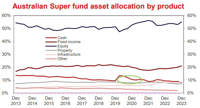
Source: Westpac
This first chart came from a Westpac report, and it was a surprise to us. There's been endless talk about how big Super is embracing alternative assets. But it's mostly talk. The chart shows aggregated Super Fund asset allocation over the past decade. Everything looks pretty much like it did in 2013. Despite super fund Chief Investment Officers, (who are now the apex predators in the investment industry food chain; $1 million+ salaries and not much accountability), talking a good book, they didn't do much last decade. They sold a few bonds when bond rates were less than 2% and threw a bit more at infrastructure (which kind of resembles bonds plus a bit of inflation), but that was about it.
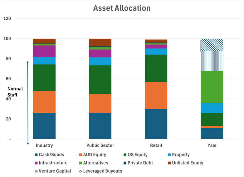
The second chart shows the asset allocation of the various types of superannuation funds, and they are all a bit same same-ish. Industry funds have a bit more infrastructure than other super funds, but it is largely still the normal assets (the bottom four boxes in the chart) that any investor can easily access. Scared of underperforming peers? Who knows? It's hard to believe this is every CIO's idea of unconstrained asset allocation.
On the far right we have shown the allocation of the Yale University Endowment Fund. That shows what a non-peer aware asset allocation looks like. Big chunks in non-traditional assets and they include a decent slab of commodities and forestry.
What is the best asset allocation?
It is a genuinely tough question, but what is the right asset allocation for long term super funds?
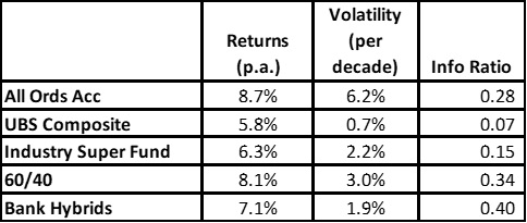
In the table we have calculated the 10year return/risk/information ratio (a measure of how much bang you get for your risk buck) for each year since 1994 (i.e the 1994 cohort reflected the returns/risk for the next decade. For the 60/40 and Industry super funds we rebalanced at the start of every year. The last cohort is from 2014 to 2024.
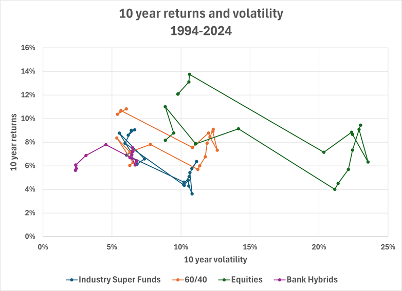
The chart shows risk and return for each of the 10 year periods since 1994 (ie decade commencing 1995, 1996 etc).
So, what does it tell us?
- Equities do best, but there are some messy decades. You probably wouldn't want to have a pure equities portfolio in the 10 years before retirement because there's a reasonable chance you only get 4% and lots of heartburn.
- The 60/40 portfolio outperformed the current Industry Super fund asset allocation. That is at least partly due to the big fall in bond rates (and Industry Funds aren't big on bonds).
- Hybrids are an example of what being a bit more adventurous can do. Returns are decent, not much risk and not much volatility of volatility (i.e) it is always low volatility. The Hybrid information ratio is materially higher too.
What does the future look like?
Super Funds have generated mid to high single digit returns over a decade holding period for the last 30 or so years. That has been comfortably above inflation. Are we going to see this over the next decade?
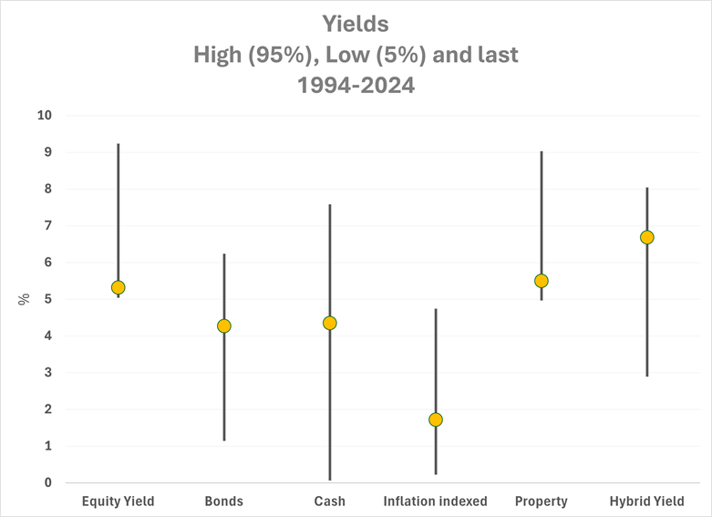
The top chart shows the current yields of some of the asset classes since 1994. We were surprised that current bond and cash rates are close to three-decade averages (we thought the average would be higher), but even so, it's only around 4%. You need other asset classes to generate more than that to get your 7%. That might be a big ask. Equity yields (based on current PE's) are very low in comparison to the last 30 years. Of course, they can get to 7% returns if there is lots of profit growth or PE expansion, but maybe that doesn't happen. Property is even worse. It is still expensive in historical terms, and we can't see rental growth saving it. And yields are at historically small margins to bond yields, so you need to see bond yields fall to get capital gains.
It's our newsletter so of course we have to give hybrids a plug. Margins might be historically tight but the yields of around 7% are top quartile since 2000. Volatility is muted unless there is material equity weakness.
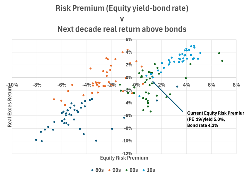
Buying equities when they are cheap should make any fund manager look like a genius. In the bottom chart we have tried to test that concept. We've taken the Equity Risk Premium (the equity yield less the bond yield - horizontal axis) each quarter since 1980 and calculated the real return of the All Ords (accumulation) less the starting bond rate (vertical axis). We've have shown the results for each of the decades as well. So, the 1980s were painful. High inflation meant relatively low real returns for equity markets and bond yields were high. That's why they are all in the bottom left-hand quadrant.
You would expect when you buy equites cheap (i.e when they show much higher yields than bonds) that you would generate higher return outcomes. That is largely true, and you can draw upward sloping lines for all decades (except the 1990s). It's not infallible though. Most worrying is that compared to recent decades, this is a seriously expensive equity market. It doesn't mean that equities are guaranteed to underperform but they are building in historically high levels of EPS growth to justify the valuation.
Campbell Dawson is Managing Director of Elstree Investment Management, a boutique fixed income fund manager. This article is general information and does not consider the circumstances of any individual investor. Elstree's listed hybrid fund trades under ticker EHF1.