Inflation is one of the most critically important issues for long-term investors, as returns can vary considerably in different inflationary conditions.
First, we consider Australian shares.
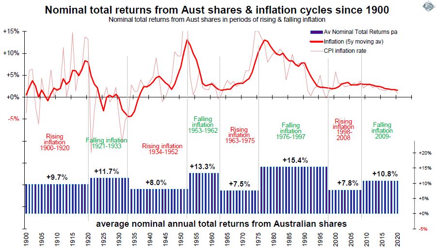
The first chart below shows the Australian inflation experience since 1900. In the upper section, the annual inflation rate is shown as a fine red line, and we also show the five-year moving average (heavy red line) to reveal the underlying inflation trend through the short-term volatility. The three main periods of high inflation were the post-WWI spike, the post-WWII/Korean War spike, and in the mid-1970s.

The lower section in the chart shows total returns (capital gains plus dividends) from the broad Australian share market during the difference phases of rising inflation and falling inflation.
Lower returns when inflation rises
The broad Australian share market generated returns averaging above 10% per year over the whole period, but returns have been very different in different inflationary conditions.
Returns during the ‘rising inflation’ phases have been consistently lower than returns during ‘falling inflation’ phases.
At first glance, these lower returns in these rising inflation phases still appear not too bad, with an average of 9.7% pa in 1900-1920, 9.0% pa in 1934-1952, 7.5% pa in 1963-1975, 7.8% pa in 1998-2008.
The problem is that these are the returns before inflation. As long-term investors we need to focus more on the returns after the wealth-destroying effects of inflation, especially since inflation has a compounding destructive effect on wealth over time.
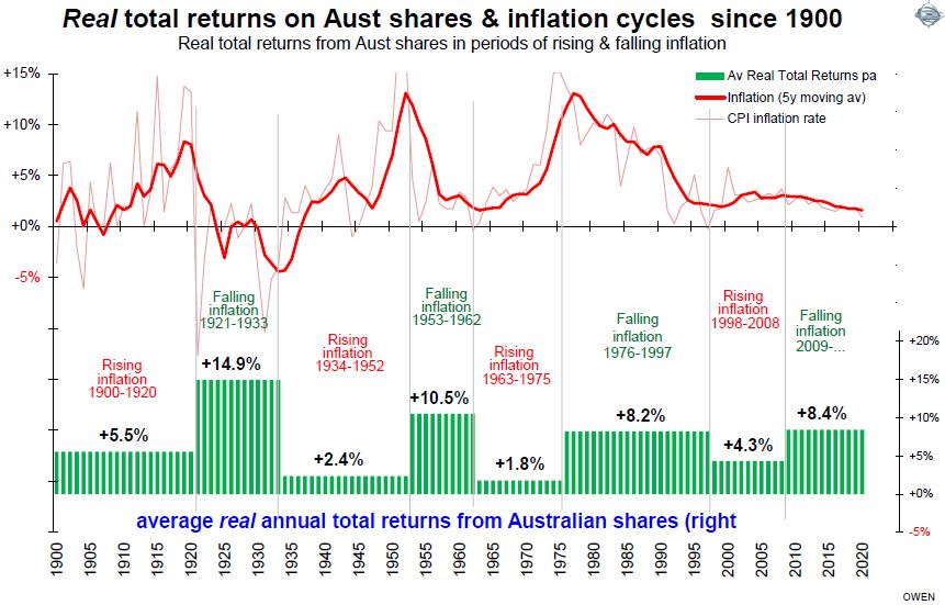
The next chart looks at the after inflation (‘real’) returns for the same periods.

This highlights the fact that the total returns after inflation have been much lower (and barely positive) in some of these relatively long periods in which inflation was rising.
Impacts on other types of investments
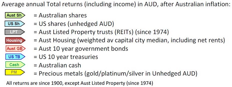
Unfortunately, inflation has similar effects on the other main types of investment assets as well, even so-called ‘inflation hedges’ like gold. We consider the following types of investment assets:

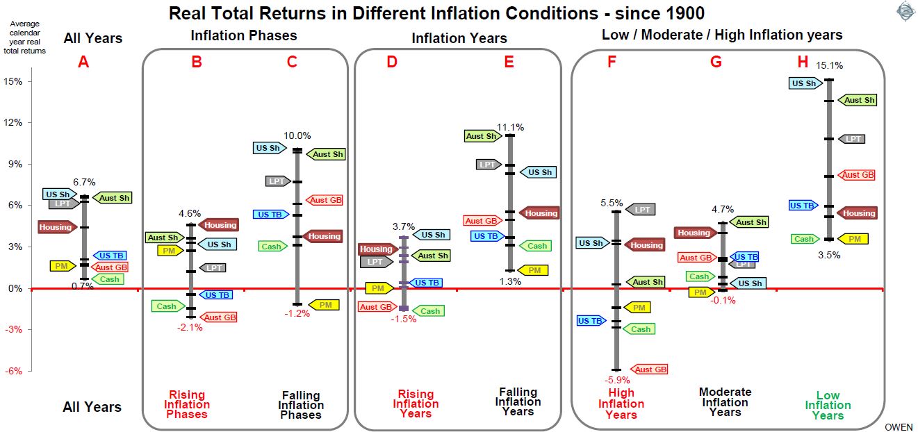
The next chart below shows total real returns from each of these asset classes in different inflationary conditions since 1900.
Column A shows overall average total returns (ie capital growth plus income) from each asset class since 1900 overall, expressed in Australian dollar terms, and after Australian CPI inflation. (We use returns in Australian dollars after Australian inflation because we are looking at returns in the hands of Australian investors who will live off their wealth in Australia).
The broad share markets in the US and Australia have generated similar total ‘real’ returns to Australian investors (averaging 6.7% and 6.6% per year respectively since 1900). Returns from Australian listed commercial property trusts (since 1974 when data is available) is not far behind at 6.2% pa.
Next in line comes Australian housing. For this, we use the weighted average of the 8-capital city median house prices, plus net rental returns (so it more or less replicates the returns from a ‘median’ house rented out at a ‘median’ rent, after average rental expenses).

The relativities between returns from the different types of assets overall (column A) are as expected – ie higher returns from shares (and listed property), reasonable returns from housing, then lower returns from government bonds (Australian and US), and then the lowest returns from Australian cash. Precious metals also generated very low real returns on average (we use a mix of gold, platinum and silver to account for periods when the private holding of gold was illegal).
How did inflation affect the returns?
While the overall average returns in column A are reasonably straightforward, the picture becomes much more interesting when we look at returns in different inflationary conditions.
Columns B and C show average returns in rising inflation (B) and falling inflation (C) ‘phases’ (these are the same phases as in the charts on Australian shares in the previous section above).
Columns D and E show returns in rising inflation years (D) and falling inflation years (E).
Finally, columns F, G and H show average returns for each type of asset in periods of ‘high’ inflation (F), ‘moderate inflation (G) and ‘low’ inflation (H). For this purpose, we define ‘high’ inflation as above 5.4% (which is the highest one-third of years since 1900 in Australia), ‘low’ inflation as below 2% (the lowest one-third of years), and ‘moderate’ inflation as the middle third of years (inflation between 2% and 5.4%).
The first aspect that stands out from the chart is that all asset classes as a group generated lower returns in rising inflation phases (B) and in rising inflation years (D), than they did in falling inflation phases (C) and falling inflation years (E). Similarly, all asset classes as a group did better in low inflation years (H) than in high inflation years (F).
In a nutshell, all asset classes as a group generated significantly higher returns when inflation was low and/or falling, but significantly lower returns when inflation was high and/or rising.
There are several major implications for long-term investors.
1. The recent above-average returns are not sustainable unless inflation remains low and/or keeps falling even further.
First, the above-average returns that have been achieved across all assets classes in recent years have been largely thanks to the fact that inflation, along with interest rates and bond yields, have been falling since 2008 and have been ‘low’ since 2014. This is the ideal ‘sweet spot’ that has always generated above-average returns from all asset classes, through numerous past cycles.
There is a danger that investors become complacent and assume that these high returns in low/falling inflation conditions are ‘normal’ and will continue in the future. The good returns in recent years are neither normal nor sustainable, unless inflation keeps falling even further, and remains in the ‘low’ (sub 2% range).
For example in the case of shares, real estate and bonds, most of the price gains over the past decade have come from increases in the amount of money people are paying per dollar of dividends from shares, rents from properties and interest on bonds, rather than rises in the actual dividends, rents and interest themselves. In the industry jargon, most of the gains have come from ‘multiple expansion’ and ‘yield compression’, and this trend has been driven by the global ‘search for yield’ as inflation and interest rates have declines to zero. These windfall price gains cannot continue unless interest rates and inflation continue to go down below zero indefinitely, which is neither possible nor likely.
2. All asset classes perform worse with high/rising inflation
If we are moving from the recent ‘falling inflation phase’ into the next ‘rising inflation phase’. We cannot merely switch between asset classes and hope to achieve similar returns to the recent past, because the whole group of asset types (including precious metals) generate lower returns in high/rising inflation years than in low/falling inflation years.
In this environment, the key is to invest in companies and other assets with genuinely rising profits and dividends and income streams, rather than rely on speculative gains. This is the reason behind the falls in the speculative tech end of share markets here and around the world in recent months.
3. Housing is adversely affected less than other assets
If we look at how each of the coloured arrows per asset class changes position across the different columns, we can see that Australian housing has been affected less adversely by high and rising inflation than the other assets. The maroon arrows for Australian housing are largely unaffected across all types of inflationary conditions, posting real total returns averaging around low to mid-single-digit returns across the board.
Note that the ‘housing’ asset class is a more complex than other asset classes. The return numbers here are based on ‘median’ prices and rents, but each house owned by each investor is unique and different. You can’t simply ‘buy the market’ with an index fund of housing like you can with shares and bonds, and returns do not allow for gearing, high transaction costs or the costs of renovations and upgrades, etc.
4. Precious metals
Precious metals (essentially gold, since gold, platinum and silver prices move almost in unison most of the time) have failed to provide a so-called ‘inflation hedge’ in practice. In rising inflation years (D), and high inflation years (F), returns were flat or negative, and worse than most other asset types.
5. Shares post the highest returns in all inflation conditions
Throughout each of the different inflation conditions, Australian and/or US shares have generated the highest real total returns, and in all types of phases, have been in positive territory. In contrast, so-called ‘defensive’ bonds have posted negative returns.
6. The temptation to chase speculation in a lower-return world
The recent phase of near-zero interest rates on cash and term deposits lured countless ordinarily conservative investors into a bewildering array of high-risk schemes and scams that promised higher returns. Many of these, including some with ‘household name’ brands, ended in big capital losses.
The next phase of rising interest rates will be different. This time, rather than low yields and high capital gains on shares and properties like the current phase, the next phase will probably see yields rise (along with interest rates) but capital gains will suffer, especially after inflation. As investors start experiencing lower returns, it will lead to the inevitable temptation to start chasing higher returns in more speculative areas once again. This temptation will be difficult to fight, but it will no doubt lead to the same poor outcomes for innocent victims.
7. Asset allocation does not change radically in rising/high inflation conditions
One key observation is that, although the overall grouping of assets class returns is significantly lower in rising and /or high inflation conditions than with low/falling inflation, the ranking of real returns from the different asset classes is more or less the same in each type of inflationary environment – ie shares do best, then commercial property, then housing in the middle, then bonds and cash at the bottom with the lowest real total returns.
It follows that the overall shape of asset allocation is probably not going to be very different in these different inflationary environments. The main change will be that returns are going to be lower if we are shifting into a ‘rising inflation’ phase.
On the other hand, the positive aspects of this shift will be that portfolio income (dividends from shares, rents from real estate, interest from bonds) is likely to be higher than in the low/falling inflation phases. A second benefit is that price volatility is also likely to be lower, especially for share markets.
8. Asset selection and tactical shifts
The likely trend to lower real total returns will increase the importance of tactical adjustments as conditions change within these ‘big picture’ shifts. Also important will be the selection of specific sectors within asset classes. For example: within share markets: the bias toward different sectors and themes like healthcare, sustainable quality, the country/regional mix, the mix of large/mid/small companies, currency hedging of international shares, and so on. Within bond markets, these decisions include: corporate bonds versus government bonds, high yield versus investment-grade, Australian versus international, and the use of floating-rate notes to complement fixed rates, active management versus passive/ETF, and so on.
Ashley Owen is Chief Investment Officer at advisory firm Stanford Brown and The Lunar Group. He is also a Director of Third Link Investment Managers, a fund that supports Australian charities. This article is for general information purposes only and does not consider the circumstances of any individual.