The Cyclically Adjusted Price to Earnings (CAPE) ratio, introduced by Nobel laureate Robert Shiller in 1988, has long been a cornerstone of market valuation metrics.
By smoothing earnings over a decade, it aims to provide a more stable, long-term perspective on market valuations. However, the CAPE ratio’s limitations have become increasingly apparent, making it a potentially misleading tool, especially when used in isolation for valuing today’s dynamic markets.
Understanding the CAPE Ratio
The CAPE ratio is calculated by dividing the current market price of a stock or index by the average of inflation-adjusted earnings over the past ten years.
CAPE Ratio = Current Market Price / Average Inflation-adjusted Earnings of the Last 10 Years
This approach aims to normalize earnings over a full business cycle, reducing the impact of temporary factors that can distort traditional P/E ratios.
CAPE’s track record: A history of underestimation
Since its introduction in 1988, the CAPE ratio has consistently projected U.S. equity returns 5-10% (or more) below realized returns over various periods. Except for the tumultuous period from the dot-com bubble to the global financial crisis, following CAPE for allocation decisions would likely have led investors into 1) the wrong asset class, 2) the wrong countries, and 3) the wrong sectors.
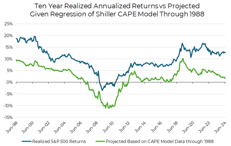
Source: Aptus via Yale.edu
Below are three critical issues with the CAPE Ratio.
Issue 1: Static stock composition myth
The CAPE ratio assumes a constant mix of stocks over time, which fails spectacularly in today’s dynamic U.S. market. High-growth tech companies such as Apple, Microsoft, Nvidia, Google, Meta, and Amazon now dominate the index, with dramatically increased earnings and market weights over the past decade.
For example, the following table shows market weights of a handful of technology companies from ten years ago vs today.
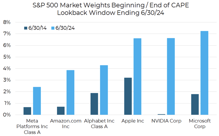
Source: Aptus via Morningstar Data
This leads to a logically inconsistent valuation:
- Price (numerator): Reflects current market cap that reflects their much larger present earnings
- Earnings (denominator): Includes smaller weights and much lower earnings from up to a decade ago
Take NVIDIA as an example: The price component accounts for its current ~7% weight in the index that reflects its 6350% earnings growth that has taken place over the past decade. Yet the earnings component includes its tiny 0.06% weight and much smaller earnings from a decade ago.
This mismatch creates a distorted picture of what an investor is actually buying. It would only be logical if one expected these companies’ earnings to plummet by over 90%—an extremely unlikely scenario for established market leaders.
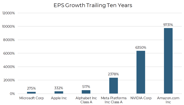
Source: Aptus via Morningstar Data
Issue 2: The buyback blind spot
The CAPE ratio fails to account for share buybacks, a key method companies use to return capital to shareholders. Unlike dividends, buybacks reduce the share count, increasing Earnings Per Share (EPS) even without a change in corporate earnings.
Consider two identical companies, differing only in capital return method:
- Company A: Returns capital via dividends
- Company B: Returns capital via buybacks
Assumptions for both companies are they have the same earnings, initial share prices, P/E ratios, business results, and policies of returning 100% of earnings to investors:
- Constant 10x P/E ratio
- 0% real EPS growth
- 10% return (earnings of $1 per $10 share price)
- 100% of earnings returned to investors
Over time this means:
- Company A: $10 share price, 10% dividend yield
- Company B: 10% annual reduction in shares, 10% increase in EPS and share price
Despite the identical businesses, the CAPE calculation shows company A with a CAPE of 10x and company B with a CAPE of 15.4x. This issue is particularly relevant in today’s US market, where buybacks are more prevalent than in the past. As a result, the current market’s CAPE ratio may not be directly comparable to its own history or to markets where buybacks are less common.
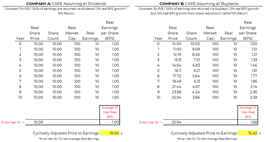
*Conceptual Illustration via Aptus
Issue 3: CAPE’s cross-market incompatibility
CAPE often paints U.S. stocks as more expensive than foreign markets. Direct comparisons between countries using CAPE ignore fundamental differences between markets. US companies are much more likely to buy back their stock than foreign companies and the U.S. market has experienced substantial earnings growth, unlike many foreign markets.
- For a market with 0% EPS growth, the CAPE ratio remains constant.
- For a market with 10% EPS growth, the CAPE ratio increases significantly over time, even if the trailing P/E remains the same.
- Conversely, for a market with -2.5% EPS growth, the CAPE ratio decreases, even if the trailing P/E remains the same.
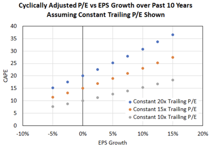
*Conceptual Illustration via Aptus
The U.S. market’s higher CAPE ratio often reflects higher EPS growth, not necessarily overvaluation.
Moving beyond CAPE
While historically significant, CAPE has become an increasingly flawed standalone valuation tool, particularly for the dynamic U.S. market. Its failure to account for changing stock composition, buybacks’ impact on EPS, and varying growth rates across sectors and markets can lead to misleading conclusions.
For modern investors, a more nuanced approach is essential. This should incorporate:
- Multiple valuation metrics beyond CAPE
- Analysis of sector-specific growth trends
- Consideration of capital return strategies (dividends vs. buybacks)
- Recognition of structural changes in market composition
By embracing a more comprehensive valuation framework, investors can navigate the complexities of today’s markets with greater accuracy and confidence. As the financial landscape continues to evolve, so too must our tools for understanding and valuing it.
Brian Jacobs, CFA is responsible for Investment Solutions and Strategy at Aptus Capital Advisors. This article is for informational purposes only and should not be considered a recommendation to purchase or sell any particular security. Be sure to consult with an investment and tax professional before implementing any investment strategy.
*Conceptual Illustration: Information presented in the above charts are for illustrative purposes only and should not be interpreted as actual performance of any investor’s account. As these are not actual results and completely assumed, they should not be relied upon for investment decisions. Actual results of individual investors will differ due to many factors, including individual investments and fees, client restrictions, and the timing of investments and cash flows.