Register For Our Mailing List

Register to receive our free weekly newsletter including editorials.

Home / 413

How inflation impacts different types of investments

Inflation is one of the most critically important issues for long-term investors, as returns can vary considerably in different inflationary conditions.

First, we consider Australian shares.

The first chart below shows the Australian inflation experience since 1900. In the upper section, the annual inflation rate is shown as a fine red line, and we also show the five-year moving average (heavy red line) to reveal the underlying inflation trend through the short-term volatility. The three main periods of high inflation were the post-WWI spike, the post-WWII/Korean War spike, and in the mid-1970s.

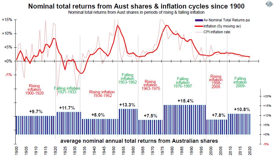
The lower section in the chart shows total returns (capital gains plus dividends) from the broad Australian share market during the difference phases of rising inflation and falling inflation.

Lower returns when inflation rises

The broad Australian share market generated returns averaging above 10% per year over the whole period, but returns have been very different in different inflationary conditions.

Returns during the ‘rising inflation’ phases have been consistently lower than returns during ‘falling inflation’ phases.

At first glance, these lower returns in these rising inflation phases still appear not too bad, with an average of 9.7% pa in 1900-1920, 9.0% pa in 1934-1952, 7.5% pa in 1963-1975, 7.8% pa in 1998-2008. 

The problem is that these are the returns before inflation. As long-term investors we need to focus more on the returns after the wealth-destroying effects of inflation, especially since inflation has a compounding destructive effect on wealth over time. 

The next chart looks at the after inflation (‘real’) returns for the same periods.

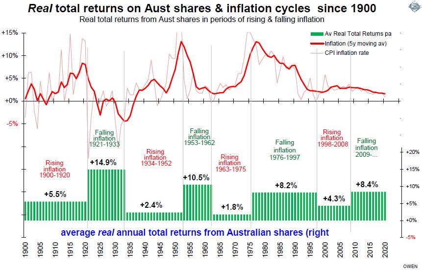
This highlights the fact that the total returns after inflation have been much lower (and barely positive) in some of these relatively long periods in which inflation was rising.

Impacts on other types of investments

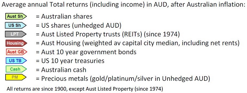
Unfortunately, inflation has similar effects on the other main types of investment assets as well, even so-called ‘inflation hedges’ like gold. We consider the following types of investment assets:

The next chart below shows total real returns from each of these asset classes in different inflationary conditions since 1900.

Column A shows overall average total returns (ie capital growth plus income) from each asset class since 1900 overall, expressed in Australian dollar terms, and after Australian CPI inflation. (We use returns in Australian dollars after Australian inflation because we are looking at returns in the hands of Australian investors who will live off their wealth in Australia).

The broad share markets in the US and Australia have generated similar total ‘real’ returns to Australian investors (averaging 6.7% and 6.6% per year respectively since 1900). Returns from Australian listed commercial property trusts (since 1974 when data is available) is not far behind at 6.2% pa.

Next in line comes Australian housing. For this, we use the weighted average of the 8-capital city median house prices, plus net rental returns (so it more or less replicates the returns from a ‘median’ house rented out at a ‘median’ rent, after average rental expenses).

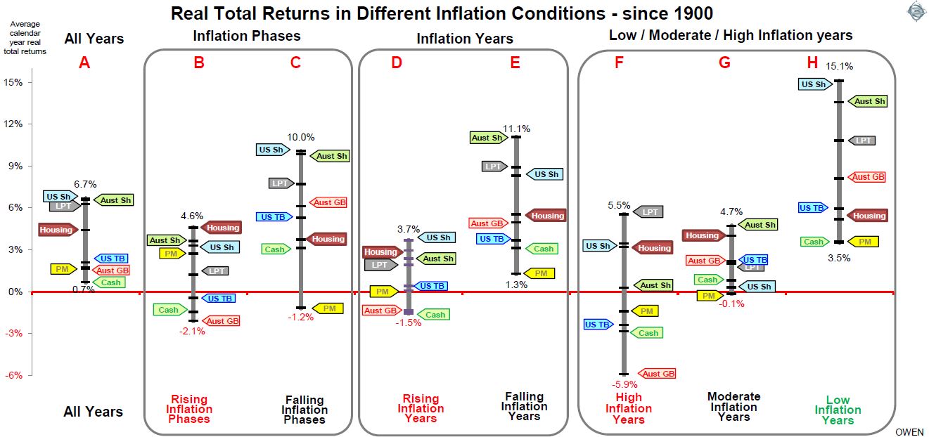
The relativities between returns from the different types of assets overall (column A) are as expected – ie higher returns from shares (and listed property), reasonable returns from housing, then lower returns from government bonds (Australian and US), and then the lowest returns from Australian cash. Precious metals also generated very low real returns on average (we use a mix of gold, platinum and silver to account for periods when the private holding of gold was illegal).

How did inflation affect the returns?

While the overall average returns in column A are reasonably straightforward, the picture becomes much more interesting when we look at returns in different inflationary conditions.

Columns B and C show average returns in rising inflation (B) and falling inflation (C) ‘phases’ (these are the same phases as in the charts on Australian shares in the previous section above).

Columns D and E show returns in rising inflation years (D) and falling inflation years (E). 

Finally, columns F, G and H show average returns for each type of asset in periods of ‘high’ inflation (F), ‘moderate inflation (G) and ‘low’ inflation (H). For this purpose, we define ‘high’ inflation as above 5.4% (which is the highest one-third of years since 1900 in Australia), ‘low’ inflation as below 2% (the lowest one-third of years), and ‘moderate’ inflation as the middle third of years (inflation between 2% and 5.4%).

The first aspect that stands out from the chart is that all asset classes as a group generated lower returns in rising inflation phases (B) and in rising inflation years (D), than they did in falling inflation phases (C) and falling inflation years (E). Similarly, all asset classes as a group did better in low inflation years (H) than in high inflation years (F).

In a nutshell, all asset classes as a group generated significantly higher returns when inflation was low and/or falling, but significantly lower returns when inflation was high and/or rising.

There are several major implications for long-term investors.

1. The recent above-average returns are not sustainable unless inflation remains low and/or keeps falling even further.

First, the above-average returns that have been achieved across all assets classes in recent years have been largely thanks to the fact that inflation, along with interest rates and bond yields, have been falling since 2008 and have been ‘low’ since 2014. This is the ideal ‘sweet spot’ that has always generated above-average returns from all asset classes, through numerous past cycles.

There is a danger that investors become complacent and assume that these high returns in low/falling inflation conditions are ‘normal’ and will continue in the future. The good returns in recent years are neither normal nor sustainable, unless inflation keeps falling even further, and remains in the ‘low’ (sub 2% range).

For example in the case of shares, real estate and bonds, most of the price gains over the past decade have come from increases in the amount of money people are paying per dollar of dividends from shares, rents from properties and interest on bonds, rather than rises in the actual dividends, rents and interest themselves. In the industry jargon, most of the gains have come from ‘multiple expansion’ and ‘yield compression’, and this trend has been driven by the global ‘search for yield’ as inflation and interest rates have declines to zero. These windfall price gains cannot continue unless interest rates and inflation continue to go down below zero indefinitely, which is neither possible nor likely.

2. All asset classes perform worse with high/rising inflation

If we are moving from the recent ‘falling inflation phase’ into the next ‘rising inflation phase’. We cannot merely switch between asset classes and hope to achieve similar returns to the recent past, because the whole group of asset types (including precious metals) generate lower returns in high/rising inflation years than in low/falling inflation years. 

In this environment, the key is to invest in companies and other assets with genuinely rising profits and dividends and income streams, rather than rely on speculative gains. This is the reason behind the falls in the speculative tech end of share markets here and around the world in recent months.

3. Housing is adversely affected less than other assets

If we look at how each of the coloured arrows per asset class changes position across the different columns, we can see that Australian housing has been affected less adversely by high and rising inflation than the other assets. The maroon arrows for Australian housing are largely unaffected across all types of inflationary conditions, posting real total returns averaging around low to mid-single-digit returns across the board.

Note that the ‘housing’ asset class is a more complex than other asset classes. The return numbers here are based on ‘median’ prices and rents, but each house owned by each investor is unique and different. You can’t simply ‘buy the market’ with an index fund of housing like you can with shares and bonds, and returns do not allow for gearing, high transaction costs or the costs of renovations and upgrades, etc. 

4. Precious metals

Precious metals (essentially gold, since gold, platinum and silver prices move almost in unison most of the time) have failed to provide a so-called ‘inflation hedge’ in practice. In rising inflation years (D), and high inflation years (F), returns were flat or negative, and worse than most other asset types.

5. Shares post the highest returns in all inflation conditions

Throughout each of the different inflation conditions, Australian and/or US shares have generated the highest real total returns, and in all types of phases, have been in positive territory. In contrast, so-called ‘defensive’ bonds have posted negative returns. 

6. The temptation to chase speculation in a lower-return world

The recent phase of near-zero interest rates on cash and term deposits lured countless ordinarily conservative investors into a bewildering array of high-risk schemes and scams that promised higher returns. Many of these, including some with ‘household name’ brands, ended in big capital losses.

The next phase of rising interest rates will be different. This time, rather than low yields and high capital gains on shares and properties like the current phase, the next phase will probably see yields rise (along with interest rates) but capital gains will suffer, especially after inflation. As investors start experiencing lower returns, it will lead to the inevitable temptation to start chasing higher returns in more speculative areas once again. This temptation will be difficult to fight, but it will no doubt lead to the same poor outcomes for innocent victims.

7. Asset allocation does not change radically in rising/high inflation conditions

One key observation is that, although the overall grouping of assets class returns is significantly lower in rising and /or high inflation conditions than with low/falling inflation, the ranking of real returns from the different asset classes is more or less the same in each type of inflationary environment – ie shares do best, then commercial property, then housing in the middle, then bonds and cash at the bottom with the lowest real total returns.

It follows that the overall shape of asset allocation is probably not going to be very different in these different inflationary environments. The main change will be that returns are going to be lower if we are shifting into a ‘rising inflation’ phase.

On the other hand, the positive aspects of this shift will be that portfolio income (dividends from shares, rents from real estate, interest from bonds) is likely to be higher than in the low/falling inflation phases. A second benefit is that price volatility is also likely to be lower, especially for share markets.

8. Asset selection and tactical shifts

The likely trend to lower real total returns will increase the importance of tactical adjustments as conditions change within these ‘big picture’ shifts. Also important will be the selection of specific sectors within asset classes. For example: within share markets: the bias toward different sectors and themes like healthcare, sustainable quality, the country/regional mix, the mix of large/mid/small companies, currency hedging of international shares, and so on. Within bond markets, these decisions include: corporate bonds versus government bonds, high yield versus investment-grade, Australian versus international, and the use of floating-rate notes to complement fixed rates, active management versus passive/ETF, and so on. 


Ashley Owen is Chief Investment Officer at advisory firm Stanford Brown and The Lunar Group. He is also a Director of Third Link Investment Managers, a fund that supports Australian charities. This article is for general information purposes only and does not consider the circumstances of any individual.


14 Comments
Ruth
June 28, 2021

Ashley, this is a very interesting article. We're entering a new era and will have to re-examine our approach. I'll be printing this one out and studying it. It's great that it's written from an Australian perspective as well. Also like that you clarified how you arrived at the PM figures. Thank you.

Michael W
June 27, 2021

Excellent Article Ashley -I wonder if it is worth detailing your source of returns/research so there is no doubt what we are comparing ?

I see above comments are along those lines as well

Your call but terrific article and very helpful to me in my current research process

James Weir
June 26, 2021

Good article Ashley, thanks for that. I have one question: in your first implication you say that much of the share market returns over they past decade have come from multiple expansion, yet in Andrew Mitchell’s article (in this same edition) his chart suggests otherwise. Is there a difference between Australian and international in this respect?

ashley
June 29, 2021

hi james,
on the sources of returns from shares - it depends very much on the period you select. For 'decade' returns I use 120 months ending Dec xxx9 (eg the '2000s' decade is end of Dec 1999 to end Dec 2009), etc. So the 'last decade' for me means the 10 years ending at the end of Dec 2019. Some people use the term 'last decade' to mean the 10 years ending in the most recent month they are looking at - so writing now it would be the 10 years to May 2021. Or maybe they mean the 10 years ending end of Dec 2020. obviously in very volatile period we are in now, it makes a huge difference to the outcomes.
for example - for the ASX market (say All Ords or ASX300) if you looked at the sources of returns for the 10 years to Dec 2020, or even the 10y to June 2021, the returns over that period came entirely from multiple expansion because earnings per share and dividends per share are both lower now than they were 10 years prior (because of the collapse in EPS and DPS in the 2020 covid recession.)
However, for the 2010s 'decade' (by which I mean the 10y ending Dec 2019) - the All Ords returned 7.9% pa. The sources of return were:
4.5% pa from divs
-1.5% pa from real EPS growth
+2.2% pa from inflation
+2.7% pa from change in p/e ratios

so a little over half of the total returns came from dividends, but most of the price returns came from PER expansion, while real earnings growth went backwards (which is the long term pattern in Australia - and that was before covid!).
A lot depends on definitions and periods used!
hope this helps
cheers
ashley

Seamus
June 24, 2021

How do you calculate real returns for gold when it was pegged for most of the period? Do you simply use the periodic official revaluations?

If the price level is rising, but gold remains pegged then it would read as gold falling in real terms, would it not?

And how is that a useful thing to know?

ashley owen
June 24, 2021

hi Seamus
on gold - for 'returns' on gold I use prices, as ignore storage/insurance costs and buying/selling costs, but I also ignore gold lending revenue (which has always been a common source of income for gold holders).
For gold prices I start with the USD price, which was fixed from 1900 to 1933, then more or less stable (but not fixed) until 1967. (I use the market prices, not theoretical price).
The second moving part is the currency. Meanwhile the Australian pound/dollar was 'fixed' at a variety of different levels up to 1971, including some large swings along the way. For Australian currency I use the local Aust currency rates set by the local banks rather than the official GBP exchange rate (which was hardly ever the actual market exchange rate), because that's what locals actually got (eg investors, importers/exporters, etc).
The third moving part is inflation, for which I use national CPI inflation rates, which were never stable.
So, as a result of these 3 moving parts, the AUD price of gold, in nominal terms and especially in real terms, was highly variable during the period.
A fourth moving part is the fact that it was illegal to hold gold for much of the period, so the US price was more theoretical than practical. So I use a basket of silver and platinum (which moved more or less in line with gold, and they moved in parallel in periods when gold was 'fixed' eg rising to 1919, then falling to 1932, and then rising in the 1960s until Bretton Woods fell apart in 1967). Silver was a popular and more accessible holding than gold, so it was a good proxy in theory and also in practice for individual investors.
A fifth moving part is FX hedging, which is a whole other story. It was impossible for individuals to hedge the currency, let alone gold for almost the entire period.
hope this helps
cheers
ashley

Jordan Eliseo
June 23, 2021

Hi Ashley - great article and stats. Curious on the gold results specially, and precious metal returns more generally. Given prices were essentially fixed up until the 1970s - how much did this affect the outcome? Ie if you just ran the data for the last 50 years (which presumably you can given you have access to the full 120 years worth), then what would the result have looked like, and how does that affect your key finding #4

ashley
June 23, 2021

hi anthony
thanks for the comments. In the mid-late 1960s, inflation was rising in Australia (like the US) - population pressures, post-war baby-boom spending, high wages in protected industries, Vietnam war spending, etc. But share prices rose due to the tremendous speculative mining/oil boom. That speculative bubble collapsed in the early 1970, but was followed by a speculative property boom (mainly highly geared commercial and residential developments). That crash was killed off by the Whitlam government's credit squeeze (designed to kill inflation and also the speculative boom), resulting in the stock market collapsing again 1973-4.
The oil price spikes (1973, 1979) were not major factors in the inflationary trend - but certainly did not help!
Unions, and the structure of labour markets / population/demographics, did play a role in inflation in the 1950s and 1960s and into the 1970s, but are less powerful now that protected industries disappeared when protection barriers were removed in the 1980s-90s.
cheers
ashley

Alan Scott
June 23, 2021

Excellent article. To me the surprising aspect was that LPTs were significantly more volatile aross all phases than housing.

ashley
June 23, 2021

hi Alan,
thanks for your feedback. On LPTs -v- housing. LPTs have the share market volatility of shares, even though the underlying assets are pretty stable. (its the same with listed shares versus private companies). the underlying commercial property market does go through huge swings (exacerbated by debt) - resulting in deep/long crashes in prices and rents - eg mid 1970s and early 1990s.
Housing is much less prone to over-building and over-supply cycles for a variety of reasons, so housing as a whole rarely collapses as deep or as long as commercial property. But it does happen - eg US housing in the GCF (housing /debt crisis triggered a systemic bank crisis, that led to a long/deep economic contraction).
In Australia the last one of those was in the 1890s - same thing - housing/debt crisis triggered a systemic bank crisis, that led to a long/deep economic contraction.

Doug Turek
June 23, 2021

This is a terrific analysis and there is a good chance we will need to become more expert in inflation investing. Well done Ashley. It would be interesting to see what was the change in A$ vs US$ in the final returns-by-era chart or show US shares and PM/gold hedged to US$. By memory in high inflation periods the A$ rises, so your observations that PM/gold didn't hedge terribly well could be currency related? If necessary local investors can buy US$-hedged gold as an ETF. By isolating our currency it would be interesting to see if Australians have a natural hedge in the A$ or not? Enjoyed the comments about valuations. By memory a lot of long period returns are driven by regime changes from low to high P/E or vice versa. In inflationary periods like the '70s when interest rates offered a competitive 10% cash return, I understand P/Es had to fall to coax investors with a higher say 2x, 8% dividend. Unless Central Banks help Governments "cheat" out of their liabilities (eg. via a G7-like debt jubilee, convert CB-owned debt to perpetual nil rate loans, swap to a new e-currency, ....) then in the event of inflation it isn't clear interest rates can rise like they did in the past (otherwise we will bankrupt indebted Gov't, corporate's and households) and so maybe we might not repeat patterns shown. Maybe "this time is different"?

James Maloney
June 26, 2021

Agreed it's a great overview, but the problem is that to get average returns (over several decades) through high/low inflation periods is not an accurate view of what investors experience year to year. For example an AVG nominal return of 8.4% in a low inflation period like the past decade has returns ranging from -30% to +20% (not 8.4%). If you want to understand risk and inflation, I've had great success with marketriskindex.com.

Anthony Asher
June 23, 2021

Nice article. I am most conscious of the 1963 to 1975 period. The averages shown here do not show that the share market more or less doubled in the first half, and lost it all in the second. http://www.rcsaustralia.com.au/wp-content/uploads/share_price_movements.pdf. One explanation is that governments lost control of the money supply leading to higher asset prices in the first instance, and then failed to respond to early signs of higher inflation. On the other hand we do not have strong unions, and oil is much less important in the overall economy.

John Adams
June 23, 2021

Excellent research, Ashley.


Leave a Comment:

RELATED ARTICLES

Investing across deflation, inflation and stagflation

Not all private markets are ‘volatility laundering’

Which asset class in Australia offers the best value now?

banner

Most viewed in recent weeks

2024/25 super thresholds – key changes and implications

The ATO has released all the superannuation rates and thresholds that will apply from 1 July 2024. Here's what’s changing and what’s not, and some key considerations and opportunities in the lead up to 30 June and beyond.

Five months on from cancer diagnosis

Life has radically shifted with my brain cancer, and I don’t know if it will ever be the same again. After decades of writing and a dozen years with Firstlinks, I still want to contribute, but exactly how and when I do that is unclear.

Is Australia ready for its population growth over the next decade?

Australia will have 3.7 million more people in a decade's time, though the growth won't be evenly distributed. Over 85s will see the fastest growth, while the number of younger people will barely rise. 

Welcome to Firstlinks Edition 552 with weekend update

Being rich is having a high-paying job and accumulating fancy houses and cars, while being wealthy is owning assets that provide passive income, as well as freedom and flexibility. Knowing the difference can reframe your life.

  • 21 March 2024

Why LICs may be close to bottoming

Investor disgust, consolidation, de-listings, price discounts, activist investors entering - it’s what typically happens at business cycle troughs, and it’s happening to LICs now. That may present a potential opportunity.

The public servants demanding $3m super tax exemption

The $3 million super tax will capture retired, and soon to retire, public servants and politicians who are members of defined benefit superannuation schemes. Lobbying efforts for exemptions to the tax are intensifying.

Latest Updates

Retirement

Uncomfortable truths: The real cost of living in retirement

How useful are the retirement savings and spending targets put out by various groups such as ASFA? Not very, and it's reducing the ability of ordinary retirees to fully understand their retirement income options.

Shares

On the virtue of owning wonderful businesses like CBA

The US market has pummelled Australia's over the past 16 years and for good reason: it has some incredible businesses. Australia does too, but if you want to enjoy US-type returns, you need to know where to look.

Investment strategies

Why bank hybrids are being priced at a premium

As long as the banks have no desire to pay up for term deposit funding - which looks likely for a while yet - investors will continue to pay a premium for the higher yielding, but riskier hybrid instrument.

Investment strategies

The Magnificent Seven's dominance poses ever-growing risks

The rise of the Magnificent Seven and their large weighting in US indices has led to debate about concentration risk in markets. Whatever your view, the crowding into these stocks poses several challenges for global investors.

Strategy

Wealth is more than a number

Money can bolster our joy in real ways. However, if we relentlessly chase wealth at the expense of other facets of well-being, history and science both teach us that it will lead to a hollowing out of life.

The copper bull market may have years to run

The copper market is barrelling towards a significant deficit and price surge over the next few decades that investors should not discount when looking at the potential for artificial intelligence and renewable energy.

Property

Global REITs are on sale

Global REITs have been out of favour for some time. While office remains a concern, the rest of the sector is in good shape and offers compelling value, with many REITs trading below underlying asset replacement costs.

Sponsors

Alliances

© 2024 Morningstar, Inc. All rights reserved.

Disclaimer
The data, research and opinions provided here are for information purposes; are not an offer to buy or sell a security; and are not warranted to be correct, complete or accurate. Morningstar, its affiliates, and third-party content providers are not responsible for any investment decisions, damages or losses resulting from, or related to, the data and analyses or their use. To the extent any content is general advice, it has been prepared for clients of Morningstar Australasia Pty Ltd (ABN: 95 090 665 544, AFSL: 240892), without reference to your financial objectives, situation or needs. For more information refer to our Financial Services Guide. You should consider the advice in light of these matters and if applicable, the relevant Product Disclosure Statement before making any decision to invest. Past performance does not necessarily indicate a financial product’s future performance. To obtain advice tailored to your situation, contact a professional financial adviser. Articles are current as at date of publication.
This website contains information and opinions provided by third parties. Inclusion of this information does not necessarily represent Morningstar’s positions, strategies or opinions and should not be considered an endorsement by Morningstar.