Residential house prices have surged well above pre-covid levels, despite lockdowns, high levels of underemployment, a dramatic reduction in migrant arrivals and jobs uncertainty.
Plenty of short periods of falling house prices
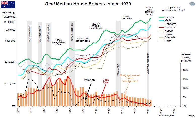
The general impression is that house prices always rise. In fact, prices slowed or contracted during the 2001-5 property finance collapses, the 2008-9 GFC and the 2010-11 sovereign debt crisis. More recently, prices were also brought down by government-imposed lending curbs, first in 2014-15 and then in 2017-18. New Zealand and several other countries have introduced lending restrictions in recent months to slow runaway house prices fuelled by debt at ultra-low interest rates. In Australia, the regulator APRA is likely to do more soon and has already announced an increase in the lending rate 'buffer' to 3%.
The chart below shows 50 years of real (inflation adjusted) house prices in Australian capital cities, and there are plenty of periods of falling prices. Another may be coming soon.

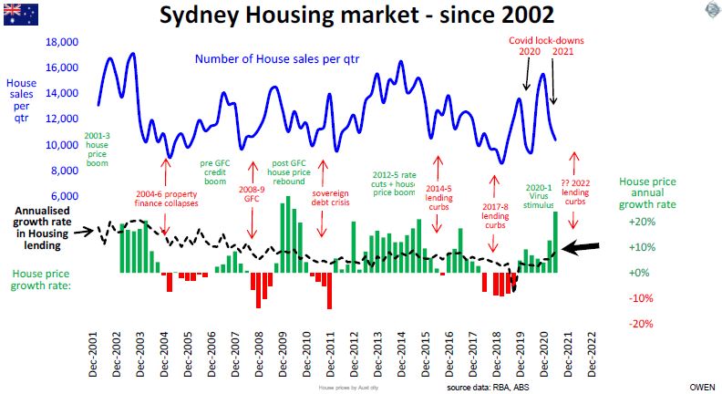
The next chart shows the Sydney housing market pulse in more detail. The blue line tracks the number of house sales per quarter, swinging widely between 16,000+ house sales per quarter in the booms, and then halving in the slowdowns. The green and red bars in the lower section show the annual rate of growth in median prices. It is currently running at 24% growth.

The black dotted line in the lower section of the last chart is the annual rate of growth in housing lending. To the right we see that in 2021, lending growth shot up again to levels that are above the those right before the 2014-5 lending curbs, and above the level right before the 2017-8 curbs.
Direct lending curbs are dressed up in a fancy name these days (‘macroprudential policy’) but they are nothing more than old-fashioned pre-deregulation lending controls in the 1950s to 1970s. Direct lending controls are better than general interest rate rises because they affect the volume of money for the lenders, not the price of money for everyone else, including business borrowers, who should be borrowing more, not less.
House prices rising but why?
House prices are rising because buyers are paying more for them, of course. But where does the extra money come from?
In 1900, the median house price in Sydney was £890 (A$1,780), and the Australian capital city median house was £730 (A$1,460). In the most recent figures (ABS June 2021) the Sydney median was $1,187,500 and the capital city median was $888,000. Over 120 years, that represents average price growth of 6.1% p.a. for both Sydney and the capital city median.
The extra money buyers pay today has come either from their own pockets (higher incomes), or from other peoples’ pockets (debt). If we strip out inflation from each of these, we can separate the sources of house price growth into three components:
(i) real wages growth above inflation
(ii) real growth in the level of debt above inflation, and
(iii) inflation.
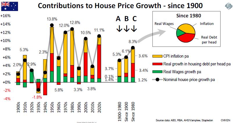
The next chart breaks out the overall growth in median capital city house prices into these three components by decade since 1900. The three bars in the middle show the summary periods. Column ‘B’ shows the overall average contributions since 1900; column ‘A’ is for the period 1900 to 1980, and column ‘C’ (and the pie chart) is for the period since 1980.

More than half of the overall growth in house prices has been due to inflation with CPI inflation averaging around 3.6% pa from 1900 up to now.
Recent price rises, funded by debt, outstrip inflation
By itself, declining real wage growth should reduce the rate of real house price growth (because people have relatively less money to spend) but this has been more than offset by a dramatic rise in housing debt. The red bars in columns A (pre-1980) and C (post-1980) show that real (ie after inflation) level of housing debt per head of population did not increase at all from 1900 to 1980 but, since then, it has grown by 3.4% pa above inflation.
Since 1980, three quarters of the growth in real house prices has come from increases in debts and only one quarter of the growth has been due to higher incomes.
Will house prices continue to rise?
Looking at the outlook for each of these three components of house price growth:
(i) For inflation - we estimate around 2-3% pa in the coming years, which is lower than the 3-4% average since 1900.
(ii) For real wages growth – we are unlikely to see a reversal of the post-1980 trend of lower real wages growth. Although we are starting to see signs of a return to protection and onshoring of some jobs in some industries, it is unlikely to reverse the effects of technology, automation, casualisation and ‘uberisation’ of work.
(iii) For debt – house prices can only keep on rising at the same rate if buyers keep increasing their level of housing debt. We consider this next.
House price growth driven mainly by increase in debt
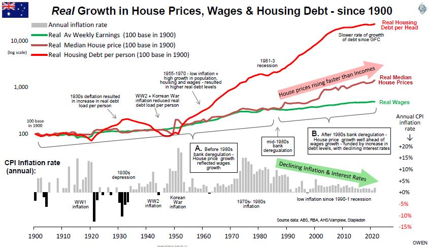
The next chart shows the growth in Australian capital city median house prices since 1900 (maroon line), and the three main components of price growth – real wages (green line), real debt per head of population (red line), and inflation (grey bars).

Until the 1980s (box ‘A’), house prices (maroon line) followed wages (green line) in almost in lockstep, which is logical because people can spend more money on housing only if they have more money to spend.
However, from the 1980s onward (box ‘B’), house prices and wages started to diverge onto different paths. What happened in the 1980s?
First, real wages growth (green line) slowed, as a result of the factors listed above. Despite the RBA pining over illusory wages growth, the trend will not reverse.
Second, the key turning point in the 1980s was bank deregulation, in particular the removal of government controls on interest rates, lending volumes, and the entry of foreign and non-banks. The ready availability of credit from many sources has increased substantially.
Third, inflation and interest rates fell (grey bars), allowing much larger loans per dollar of repayment. For example, in the late 1980s, I had a $240,000, 25 year ‘principal and interest’ mortgage. In 1989 the rate was hiked up to 18% (inflation was 8%). This increased repayments to $3,640 per month, which was more than half of my net income. This year, my daughter bought her first house, borrowing $475,000 from ANZ at 2.0% ‘interest-only’ with repayments of $791 per month, which is a small fraction of her net income. At the same age as I was, she borrowed twice the amount of my loan, but her repayments are one fifth of mine.
This huge expansion of debt (red) at lower interest rates, pushed up house prices (maroon) at a greater rate than wages growth. The chart only shows official housing debt, but there is now a sizeable amount of ‘Bank of Mum and Dad’ debt on top. Every dollar of family money pushes up prices by another dollar, creating an upward spiral fuelled by ‘FOMO’.
Interest rates cannot go lower
The 30-year boom in house prices rising well ahead of income growth is nearing an end. House prices can continue to keep on rising at rates above incomes only if interest rates continue to decline further. Interest rates have not only ended their 30-year decline, they are now more likely to rise than fall from here. The only question is when - and it will be soon.
(We have not discussed some other elements in housing – population, immigration, home ownership and supply constraints – the list goes on. Australia’s heavy reliance on immigration took a hit in the lockdowns but is likely to remain favourable for housing in the medium term, especially from China, Hong Kong and Taiwan).
Ashley Owen is Chief Investment Officer at advisory firm Stanford Brown and The Lunar Group. He is also a Director of Third Link Investment Managers, a fund that supports Australian charities. This article is for general information purposes only and does not consider the circumstances of any individual.