A milestone of sorts was passed by the Australian stock market this month. The total return index for the broad market (the All Ordinaries Accumulation Index, which includes re-invested dividends) finally clawed its way back to its November 2007 peak after nearly six years ‘underwater’.
Six years may seem a long time to wait for a recovery, but in fact the real situation is worse. In terms of the real value of wealth after CPI inflation, the real total return index is still some 14% below its peak.
Our first chart shows the accumulation index (and its predecessors) since 1900, adjusted for CPI inflation.

The global financial crisis of 2008-9 was not a ‘once in a century’ or ‘black swan’ event as it was made out to be. There have been plenty of crashes of similar size or worse in the Australian market. Major collapses like these have occurred every decade or so, and it has almost always taken longer than six years to recover.
Why is it relevant to look at this peak-to-recovery performance? Is it fair to look at performance starting from the boom-time peaks?
It is important because, sadly, many thousands of investors were enticed into the market right near the top by the media frenzy in the height of the boom. Adding to the flurry of share buying was the government’s $1 million window for lump superannuation contributions that closed in June 2007. The impact of this government measure was very similar to the introduction of franking credits in July 1987. In both cases, large numbers of investors were caught up in the frenzy, sold other assets (incurring tax liabilities in many cases) and bought shares or contributed to super funds that in turn bought shares at the height of the boom, only to see their values halve in the crash that followed shortly after.
In both cases the flood of extra money from new investors pushed share prices even higher in the boom, meaning they had further to fall in the bust that followed.
Price index
Looking at total returns like this is academic for many investors because the total return index assumes religious reinvestment of all dividends over the whole period. Retirees who live off the dividend income are more interested in share prices and not total returns, since they spend the dividends.
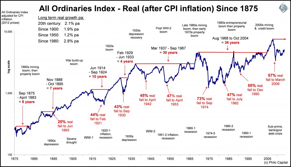
If we look at the real price index (adjusted for CPI inflation) we see a different story:

Here we see two separate periods in which it took 30 years or more for the broad diversified share price index to recover. That’s a whole generation at a time waiting for the market to recover from crashes after booms, which is when many people buy into the market.
Readers with a keen eye will notice that the All Ordinaries index today is barely above its August 1968 peak in real terms after inflation some 45 years later. Actually it’s up just 0.5% pa. That’s 45 long lean years of virtually zero price growth for people who bought into the large index stocks at the height of the boom.
What were those stocks that dominated the index 45 years ago? It’s mainly the same old companies that dominate it today (with some exceptions, notably CBA which was floated in 1991). Of the big cap stocks in 1968, the share prices of Bank of NSW (Westpac), BHP, AGL, Woodside and QBE are all less than 3% pa ahead after inflation (and after adjusting for capital structure changes). However the share prices of ANZ, NAB, CRA (RIO), Santos and Lend Lease are all still below their 1968 boom time highs - after 45 years!
That’s 45 years to wait just to get back to square after inflation, let alone make any real capital growth, for those who bought in the boom.
These are broad index returns that are largely driven by the largest stocks. Many investors don’t just stick to the boring big stocks at the height of booms. Many are lured into speculative 'hot stocks', and most of these inevitably disappear altogether in the crashes that follow the speculative booms.
How long to recover the 2007 peak?
Even for those investors who did avoid the 'hot stocks' and stuck to the big boring companies, it will probably be many, many years before the All Ordinaries index recovers to its 2007 boom-time high in real terms after inflation. Today the index is around 5,200 and the November peak level was 6,853 so the market index will need to rise by a further 32% from current levels to get back to the peak level.
However, the inflation-adjusted November 2007 peak target is now 7,900 and climbing steadily with inflation. It would require the market to rise by another 50% from current levels to get back to the inflation-adjusted peak. If that takes another say three years to achieve, then that’s three more years of inflation of say 2.5% each year. That raises the target by another 8%, which means it would require a rise of 64% from today’s level to achieve over three years. That’s a big ask.
Inflation is a silent destroyer of wealth, and it is a major reason why it takes such a long time to recover from busts.
It will be a long, long wait for those who bought in the boom, but that is the way it has always been. Investors who bought the 'time-in-the-market' and 'buy & hold' myths and the efficient markets hocus pocus will have a very long wait indeed.
This story refers to the returns from the broad diversified index. Let’s not forget that most fund managers fail to beat even the broad market index after taxes and fees. In future instalments I will cover the return histories of individual companies to see which fared better or worse than the broad diversified index over time.
Ashley Owen is Joint Chief Executive Officer of Philo Capital Advisers and a director and adviser to Third Link Growth Fund.