Register For Our Mailing List

Register to receive our free weekly newsletter including editorials.

Home / 509

Stocks are less risky than bonds in the long term

OK, we admit. That headline was to draw you in. But it is correct, with one tiny caveat: 'in the long run'. At least that’s what the data shows, as we’ll explain in this article.

Stocks versus bonds is a vital question given the rise in bond yields and interest rates in most major markets over the last 18 months.

We have gone from a TINA (There Is No Alternative) investing environment where shares were often seen as the only game in town when interest rates were near zero to a TIARA investing world (There Is A Reasonable Alternative) where bond yields have become more attractive.

While investors may be tempted by ‘less risky’ bonds, it’s vital to understand the long-term picture. A sudden shift into bonds could dent an investor’s ability to build long-term wealth and protect against inflation if that is their goal.

Wow factor

If you’ve read enough investment articles over the years, you have probably come across a long-term returns chart like the one below.

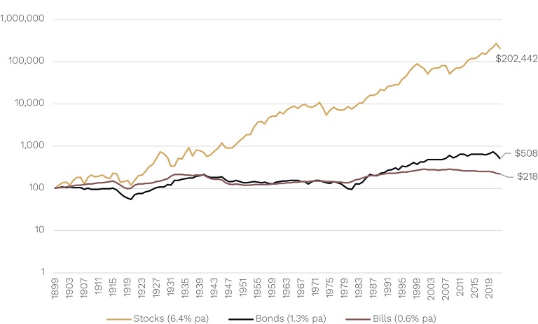
United States: Cumulative Growth of $100 (real terms)
Source: Cambridge Decades of Data, Factset, Ophir. Data from 1 January 1900 to 31 December 2022.

The chart shows how much a US$100 investment in year 1900 (the equivalent of about US$4,000 in today’s dollars) would have grown to by the end of 2022 if you’d invested in U.S. stocks, bonds or bills (you can also think of bills as short-term term deposits for those in Australia).

Here we show it in ‘real’ terms, that is after inflation, because without doing so the numbers start to look nonsensical. And ultimately over long periods of time what investors generally care most about is how much their purchasing power (wealth increases above inflation) has grown.

We’ve also shown it with a ‘log’ vertical axis because again, if we don’t it would look crazy as you would barely be able to see the bonds and bills lines given how much shares won by.

The main takeaway from these charts is usually: 'Wow! It’s insane how much shares have outperformed over the very long term'.

Dramatically less risky

The difficulty many investors have though sticking with shares is they can be volatile/risky/a rollercoaster over the short term.

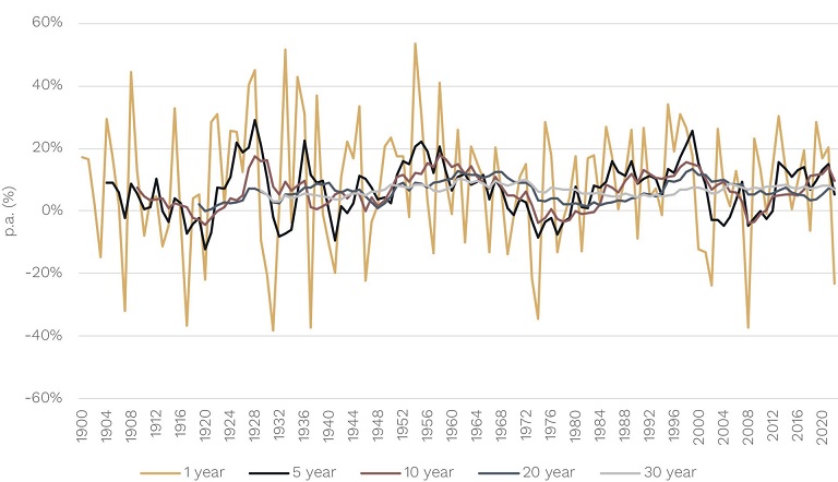
In this next chart, the gold lines show the real annual returns for the U.S. share market since 1900. They are all over the place. The fact the vertical axis has to go from -60% to +60% to fit the returns in should give you some idea of the wild year-to-year ride.

USA: Real Holding Period Returns – Shares
Source: Cambridge Decades of Data, Factset, Ophir. Data from 1 January 1900 to 31 December 2022.

However, we’ve also shown the rolling 5, 10, 20 and 30 year per annum returns in the other lines. The ride becomes a lot less volatile as you move out to longer time horizons.

At 10-year horizons, negative real returns become quite rare. And at 20+ year horizons they disappear completely (historically investors have never lost money in real terms for investing periods of 20 years or more in U.S. shares).

The chances of losing money in the share market has tended to become DRAMATICALLY smaller the longer you are invested.

Positively placid

How does this compare to U.S. bonds, which are once again tempting us with their yields, you may ask?

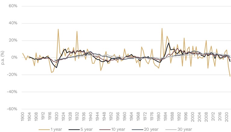
Using the same sized vertical axis, below you can see that annual U.S. bond returns are nowhere near the same roller coaster ride as shares.

USA: Real Holding Period Returns – Bonds
Source: Cambridge Decades of Data, Factset, Ophir. Data from 1 January 1900 to 31 December 2022.

Yes, they can toss you around a little every now and then, but the ride is way less stomach churning and not really going to turn you upside down and have your money fall out of your pockets.

(Note 2022 was one of the exceptions when long-term bond yields increased materially (bond prices declined) and you had high unanticipated inflation producing the largest negative real annual return over this 123-year period!).

Like shares, though, when you move to longer investment horizons, the ride becomes less bumpy and positively placid at 20+ years.

The importance of time horizon

But at longer investment horizons, like 10 or 20+ years, are shares still riskier than bonds? This is a crucial question.

That time horizon is the bare minimum horizon for most investors saving for their retirement.

(Some investors might argue that a 20+ time horizon is way too long. But many, particularly those in accumulation phase, have horizons of 40-50 years, and up to 60 years if you include retirement. Even a retiree at 67 who lives well into their 90s, increasingly common as we live longer, has a horizon of way more than 20 years.)

Yet many investors let year-to-year movements in different asset classes like shares and bonds determine their longer-term allocations.

The risk of doing that is potentially missing out on the power of equities to grow and protect wealth from inflation over the long term.

The greatest investment chart

This leads us to what is without doubt our favourite investment chart of all time. Our favourite mostly because it upends that ‘lesson’ from Investing 101: that risk is always related to return … and the riskier an investment, the higher return it should provide you.

It underpins one of the most commonly held assumptions about investing: that stocks are riskier than bonds.

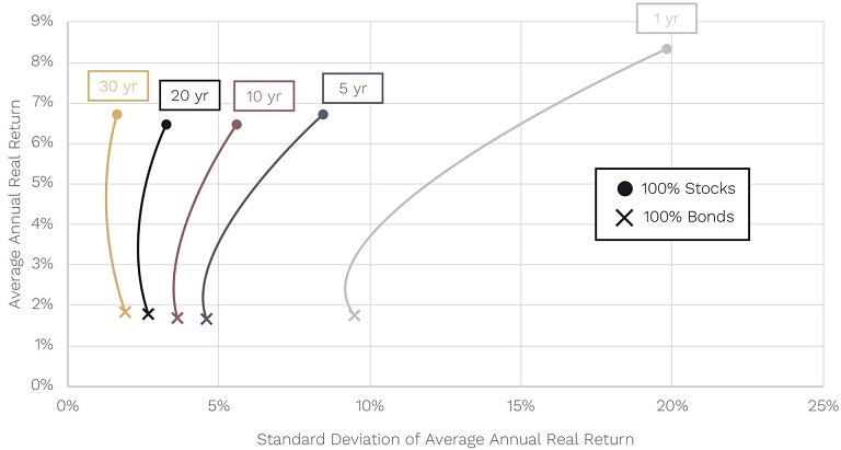
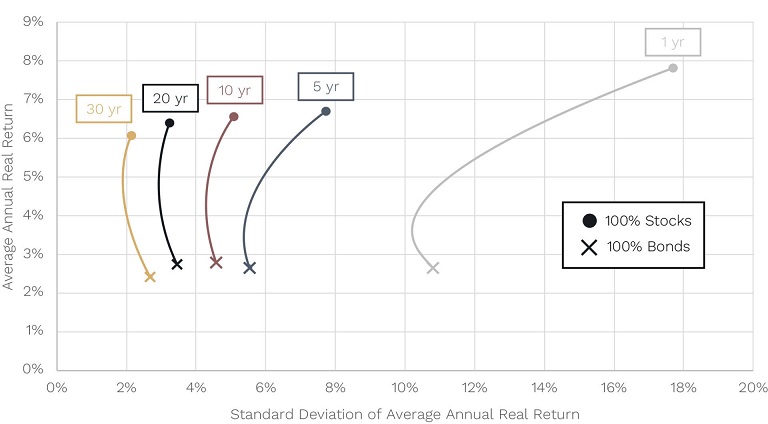
U.S. Equities & Bonds: Risk-Return Trade-Off for Various Holding Periods, 1900-2022
Source: Cambridge Decades of Data, Factset, Ophir. Data from 1 January 1900 to 31 December 2022.

They certainly have tended to provide higher long-term returns. Just see our first chart. And they certainly look riskier over the short term. Just see our second and third chart. But are they riskier over the long term?

Now our favourite chart takes a little explaining. But buckle in because its lesson is worth the effort. It’s a lesson that in our experience many seasoned professionals haven’t even heard or seen of before.

The previous chart shows the average real (after inflation) returns for portfolio mixes of U.S. shares and U.S. bonds on the vertical axis over different holding periods (rolling one year to rolling 30 year) since 1900.

Using standard deviation as a measure of volatility, it also shows the range of outcomes around the average – or how risky – each portfolio is for each holding period on the horizontal axis.

As you can see, as you move down each line (from top to bottom) and progressively add more bonds to your portfolio, average portfolio returns decline.

Nirvana

Historically, a 100% U.S. stock portfolio is way riskier than 100% U.S. bond portfolios over holding periods of one year. A no brainer here – stock returns move around a lot more than bond returns over the short term, as we saw earlier. But here is where it gets interesting.

Historically as your holding period has moved from one year out to 30 years, the riskiness of a 100% U.S. stock portfolio has radically decreased such that by the time you reach a 30-year holding period we enter nirvana.

At 30 years, stocks have earned higher average real returns than bonds (and by a lot we might add!) … but they are also less risky!

Incredible.

This outcome also holds for the Australian share market, as you can see in the chart below. In fact, in Australia, stocks become less risky than bonds at even shorter horizons. By the time you reach a 20-year horizon, stocks are less risky.

Australian Equities & Bonds: Risk-Return Trade-Off for Various Holding Periods, 1911-2022
Source: Cambridge Decades of Data, Factset, Ophir. Data from 1 January 1911 to 31 December 2022.

The prize of patience

Investors only considering the short term may be lured by the siren call of ‘less risky’ bonds. That lure is becoming stronger now that bond yields have become more attractive. But, as we’ve discussed, investors’ time horizons are much longer than many may think.

To reach their investment and retirement lifestyle objectives, long term investors need exposure to the superior long-term returns of shares.

Shares have also tended to be a good long-term inflation hedge due to the ability of companies to pass on price increases. But bonds have a mixed record here and your purchasing power can get crushed during periods of unanticipated inflation that exceeds the fixed levels of income it provides (just see 2022!).

The good news is shares not only deliver superior wealth building and inflation protection, but history suggests they have also been less risky over longer time horizons. It’s a powerful combination for the patient investor.

To the victor go the spoils … if only investors can resist getting worried out of the market by the short-term volatility of shares.

As Warren Buffett once wisely said:

“The sharemarket is a device for transferring money from the impatient to the patient.”


Andrew Mitchell is Director and Senior Portfolio Manager at Ophir Asset Management, a sponsor of Firstlinks. This article is general information and does not consider the circumstances of any investor. Notes on return sources can be viewed via the original article here.

Read more articles and papers from Ophir here.


15 Comments
Kyle Ringrose
September 15, 2023

Great paper Andrew

I think it graphically illustrates a major issue that long horizon investors (i.e. super funds) are having trouble coming to grips with. You have demonstrated that using volatility as a proxy for risk ignores the different outcomes for short and long term investors. The Standard Risk Measure shown in a super fund's PDS is a measure of short term volatilty which is often being applied to a long term investment. This can provide very misleading information to the consumer.

As Geoff points out, risk to a super fund member in accumulation phase is not market volatility, it is failure to maximise wealth at the point of retirement.

Geoff Warren
May 19, 2023

Just a couple of comments from someone who has done a fair bit of research in this area. When measuring risk over long horizons it is better to analyse at variation in resulting portfolio values (wealth) than variation in per annum returns. When doing so, you often find that while equities are highly likely to deliver higher wealth than fixed income at the end of very long periods, they can also offer some probability of a VERY poor outcome that is beyond the losses in fixed income. This leads to the question of how much tolerance an investor has for a large loss of wealth, even if unlikely. How you view these issues also depends on whether you are just accumulating wealth or intend to draw funds from your portfolio. Bottom line is that it is nuanced..

Dudley
May 19, 2023

"analyse at variation in resulting portfolio values (wealth) than variation in per annum returns":
"also offer some probability of a VERY poor outcome that is beyond the losses in fixed income":

In the medium term crashes in share prices result in share out performance 'vaporising' and returning to cash / fixed interest performance or less, ... then off to the races again.

If the end of someone's days is in the medium term then they might prefer less hiccuping. Which is possible where they have more capital than 25 to 50 times withdrawals / expenses.

Where the rate of withdrawal is greater than the rate of return, it can take a long time for $ withdrawals to exceed $ returns - WHERE $ CAPITAL is > ~50 TIMES $ WITHDRAWAL / y.

In the meantime, before the long time, they are dead - leaving a significant lump sum.

Andrew Mitchell
May 24, 2023

Definitely, and without getting into whitepaper length detail, agree with you lots of nuance here Geoff. Ultimately, as you say, most investment portfolios are either accumulating or decumulating and therefore the shorter term sequence of returns (and their volatility) can matter a lot. Here things like monte carlo simulation of wealth values and risk tolerance/capacity all come into play at a practical personal level. All great topics for future articles perhaps that I think deserve more attention than they get.

S2H
May 19, 2023

I concur that the standard deviation/returns chart is a winner. Informative, simple and attractive. Big tick.

Andrew Mitchell
May 22, 2023

Thanks. A lot of investors only see that one year risk/return trade off so I find it useful to see how that changes as the time horizon gets longer.

Steve-
May 18, 2023

I think the comparison is a bit more nuanced than is portrayed in the charts. Sure, if you use an equity index as your benchmark, the narrative is more compelling the further back in time you go. Most leading equity indices are constructed by market capitalisation which translates into an inherent upward bias over time. A US investor in the 1960s whose first venture into the world of equities was to invest in the Nifty Fifty (household names) saw more than three-quarters of the value of their investment eroded within the next decade. In terms of risk, that is an outlier that does not show up in the charts above. Unfortunately, these outlier events are the reality for many that can and do live on in the minds of investors.

Dudley
May 18, 2023

"Always the interpolation depends on the start and end times selected." "A precise interpolation is not a guarantee of accurate extrapolation." "You can go irrational long before the market comes to your senses." That the 'Average Annual Real [Rate of] Return' is not constant for all 'Holding Periods' indicates a (minor) sampling error.

Andrew Mitchell
May 22, 2023

Thanks Steve and agree many investors will have had different outcomes in the more distant past and cap weighted index funds didn't exist for a lot of the 1900s. Researchers tend to use it for historical analysis as its generally the best measure of "the market" and also on a go forward basis is an investable option.

Neil
May 18, 2023

It really depends on what your definition of “risk” is. A risk means the probability of something happening outside your expectations. In this sense, there are many different types of risk when it comes to investing.

Is the “risk” you want to protect against a RETURN OF your investment (default risk) or is it knowing what the RETURN ON your investment (volatility risk) will be.

Andrew Mitchell
May 18, 2023

Absolutely Neil. I've always like Elroy Dimson's definition of risk being "Risk means more things can happen than will happen".

For this analysis I've focused on what I think most care about at an asset class level which is volatility of returns after inflation. Though acknowledge there are many different ways you can do the analysis and not everyone has the same definition of risk.

Mark Beardow
May 21, 2023

Hi Andrew, I tend to agree with Geoff that the full distribution of real returns is more informative than just volatility…but your point about long term perspective is spot on. I wonder what the charts would look like with risk as worst 5 or 10% of the wealth distribution. Also interested in what implications your analysis has for stock selection and active equity management.

Andrew Mitchell
May 24, 2023

Hi Mark. Agree 5th or 10th percentile of distribution would be interesting to look at. Perhaps even (re my comment above with Geoff) using simulation over a lifecycle for accumulation then decumulation investor. Re the second part for me its really just how skewed in your favour long term returns are (including how much vol for shares reduces v's fixed income as horizons lengthen) and therefore the opportunity cost of holding high cash levels or tactically trying to time tops and bottoms. Also the size of the negative impact of unanticipated inflation on real fixed income returns is an eye opener.

James
May 20, 2023

Risk = consequence x chance

Andrew Mitchell
May 22, 2023

That's certainly one great way to look at it John with all the possible outcomes listed, their probabilities and their impact.


Leave a Comment:

RELATED ARTICLES

Picking winners: the origins of the specious

Survive the next crash by learning from the Stoics

Breaking down 2023 returns for the ASX

banner

Most viewed in recent weeks

Vale Graham Hand

It’s with heavy hearts that we announce Firstlinks’ co-founder and former Managing Editor, Graham Hand, has died aged 66. Graham was a legendary figure in the finance industry and here are three tributes to him.

Australian stocks will crush housing over the next decade, one year on

Last year, I wrote an article suggesting returns from ASX stocks would trample those from housing over the next decade. One year later, this is an update on how that forecast is going and what's changed since.

Avoiding wealth transfer pitfalls

Australia is in the early throes of an intergenerational wealth transfer worth an estimated $3.5 trillion. Here's a case study highlighting some of the challenges with transferring wealth between generations.

Taxpayers betrayed by Future Fund debacle

The Future Fund's original purpose was to meet the unfunded liabilities of Commonwealth defined benefit schemes. These liabilities have ballooned to an estimated $290 billion and taxpayers continue to be treated like fools.

Australia’s shameful super gap

ASFA provides a key guide for how much you will need to live on in retirement. Unfortunately it has many deficiencies, and the averages don't tell the full story of the growing gender superannuation gap.

Looking beyond banks for dividend income

The Big Four banks have had an extraordinary run and it’s left income investors with a conundrum: to stick with them even though they now offer relatively low dividend yields and limited growth prospects or to look elsewhere.

Latest Updates

Investment strategies

9 lessons from 2024

Key lessons include expensive stocks can always get more expensive, Bitcoin is our tulip mania, follow the smart money, the young are coming with pitchforks on housing, and the importance of staying invested.

Investment strategies

Time to announce the X-factor for 2024

What is the X-factor - the largely unexpected influence that wasn’t thought about when the year began but came from left field to have powerful effects on investment returns - for 2024? It's time to select the winner.

Shares

Australian shares struggle as 2020s reach halfway point

It’s halfway through the 2020s decade and time to get a scorecheck on the Australian stock market. The picture isn't pretty as Aussie shares are having a below-average decade so far, though history shows that all is not lost.

Shares

Is FOMO overruling investment basics?

Four years ago, we introduced our 'bubbles' chart to show how the market had become concentrated in one type of stock and one view of the future. This looks at what, if anything, has changed, and what it means for investors.

Shares

Is Medibank Private a bargain?

Regulatory tensions have weighed on Medibank's share price though it's unlikely that the government will step in and prop up private hospitals. This creates an opportunity to invest in Australia’s largest health insurer.

Shares

Negative correlations, positive allocations

A nascent theme today is that the inverse correlation between bonds and stocks has returned as inflation and economic growth moderate. This broadens the potential for risk-adjusted returns in multi-asset portfolios.

Retirement

The secret to a good retirement

An Australian anthropologist studying Japanese seniors has come to a counter-intuitive conclusion to what makes for a great retirement: she suggests the seeds may be found in how we approach our working years.

Sponsors

Alliances

© 2024 Morningstar, Inc. All rights reserved.

Disclaimer
The data, research and opinions provided here are for information purposes; are not an offer to buy or sell a security; and are not warranted to be correct, complete or accurate. Morningstar, its affiliates, and third-party content providers are not responsible for any investment decisions, damages or losses resulting from, or related to, the data and analyses or their use. To the extent any content is general advice, it has been prepared for clients of Morningstar Australasia Pty Ltd (ABN: 95 090 665 544, AFSL: 240892), without reference to your financial objectives, situation or needs. For more information refer to our Financial Services Guide. You should consider the advice in light of these matters and if applicable, the relevant Product Disclosure Statement before making any decision to invest. Past performance does not necessarily indicate a financial product’s future performance. To obtain advice tailored to your situation, contact a professional financial adviser. Articles are current as at date of publication.
This website contains information and opinions provided by third parties. Inclusion of this information does not necessarily represent Morningstar’s positions, strategies or opinions and should not be considered an endorsement by Morningstar.